
This guide covers the visualization features within WisdomAI’s Dashboards and Chats. It explains how to analyze trends, compare categories, and adjust data display settings. The following sections describe:Documentation Index
Fetch the complete documentation index at: https://docs.wisdom.ai/llms.txt
Use this file to discover all available pages before exploring further.
- The catalog of available chart types to represent your data visually.
- Options for switchable encodings that allow you to adjust axis assignments, filters, and aggregations.
- Built-in interaction options to customize queries and validate results.
- Key accessibility features designed to make Dashboards approachable for all users.
Chart catalog
WisdomAI’s Dashboards support a variety of chart types to represent data insights effectively. Users can select the desired chart type through a dropdown menu in the Editor tab.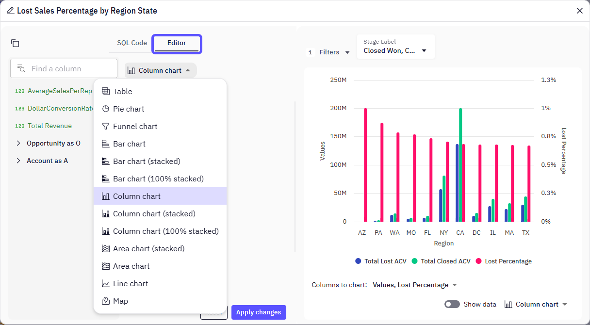
Available chart types
| Chart Type | Feature |
|---|---|
| Table | Displays raw data in a structured format, ideal for precise values and detailed comparisons. |
| Pie Chart | Best for showing proportions within a whole, where each slice represents a percentage of the total. (Consider using for 5-7 slices maximum.) |
| Funnel Chart | Illustrates how values progress through different stages of a sequential process, often used to visualize conversion or attrition rates. |
| Bar Chart | Useful for comparing quantities across discrete categories, with the length of the bars representing the values. |
| Bar Chart (stacked) | Displays multiple data series in a single bar, where segments within the bar show the contribution of each part to the whole. Useful for comparing sub-categories and their cumulative totals. |
| Bar Chart (100% stacked) | Similar to a stacked bar chart, but each bar represents 100% of a category, with segments showing the percentage contribution of subcategories. Ideal for showing part-to-whole relationships and how proportions change over time. (Be cautious as overall totals are not explicitly shown.) |
| Column Chart | Visually represents numerical values using vertical columns. Ideal for comparing discrete categories, often with the height of the column corresponding to the value. |
| Column Chart (stacked) | Presents multiple data series as vertical bars, with segments stacked to show their cumulative sum. Aids in comparisons between categories over time or across different groups. |
| Column Chart (100% stacked) | Compares multiple measures by stacking bars vertically, where each segment represents the percentage of the overall category total. Useful for showing the distribution of components within a whole at a specific point in time or across time. |
| Area Chart (stacked) | Shows data as an area under a line that connects data points, with multiple series stacked on top of each other. Useful for displaying the contribution of different components to a whole while showing overall patterns and cumulative trends over time. |
| Area Chart | Visualizes quantitative data and shows how values change over time, with the area between the line and the baseline filled with color. Ideal for emphasizing trends and the magnitude of change. |
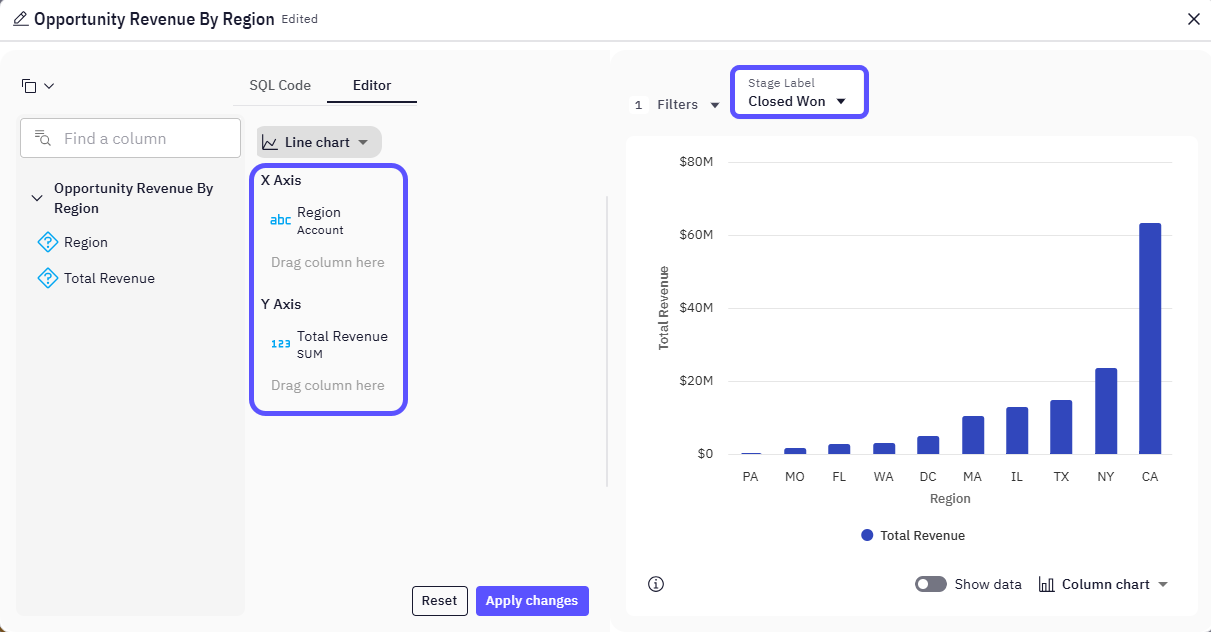
| Line Chart | Ideal for displaying trends over time or across continuous measurements, showing how data changes and identifying patterns. (Excellent for time-series data.) |
| Map | Transforms geographic data into visual insights by displaying information across different regions, countries, or territories. Useful for visualizing spatial patterns and distributions. |
Switchable encodings
Within the Editor tab, users can customize data encodings to refine their visualizations, for example:- Axis Assignment – Drag and drop data columns to assign them to the X and Y axes
(e.g., “Region” on X-axis, “Total Revenue SUM” on Y-axis). - Data Filtering – Apply filters to focus on specific data subsets
(e.g., “Stage Label: Closed Won”). - Aggregation Functions – Use SUM, AVG, etc., to aggregate numerical data as needed.
Interaction options
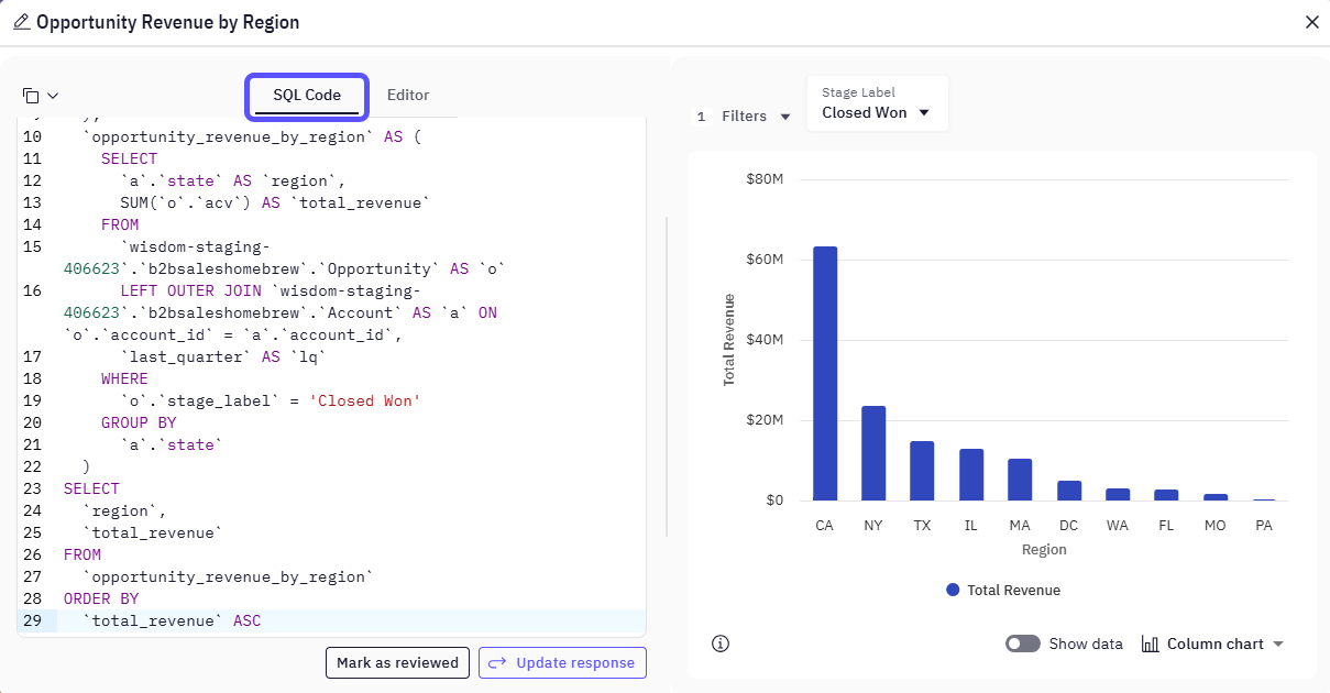
WisdomAI provides interactive elements to enhance user engagement and data exploration:- Editable SQL – Modify the generated SQL queries in the SQL tab to correct or fine-tune results.
- Feedback Mechanism – Give a thumbs up or down to improve future AI responses.
- Review & Validation – Mark queries as reviewed to confirm accuracy in team workflows.
Accessibility notes
WisdomAI emphasizes accessibility to ensure a wide range of users can effectively engage with Dashboards:- Natural Language Interface – Ask questions using plain English to generate data queries.
- Visual Configuration Tools – Use drag-and-drop components in the Widget Editor to configure visuals without writing code.
- Collaborative Integrations – Access insights directly from platforms like Slack or Teams, supporting seamless workflows.
Next steps
Auditing
Organize insights by tagging chats, navigating history, and sharing vetted answers with your team.
Advanced Data Modeling: Creating Context
Define relationships and context in your data to enable more powerful analysis.